
Sunset Mag: 7 Unexpected Paint Colors West Coast Designers Secretly Love
A fresh coat that packs a punch.
Featured on Sunset.com | By Kelsey Mulvey | February 13, 2026
Fabric swatches, furniture, and clever layouts might be integral to great design, but very few things can transform a room like a fresh coat of paint. Whether you want to drench a space in the same hue or add an unexpected jolt of pigment, a little bit of color can go a long, long way.
But which shade to choose? While there are a rainbow of options, most people associate the West Coast with neutrals. Simple, versatile, and truthfully, a little predictable.
The reality, however, is quite different. Not only do West Coast designers use all sorts of colors, but there are also a few surprising shades they secretly swear by. So, we asked a few pros to share the hues they can’t stop using.
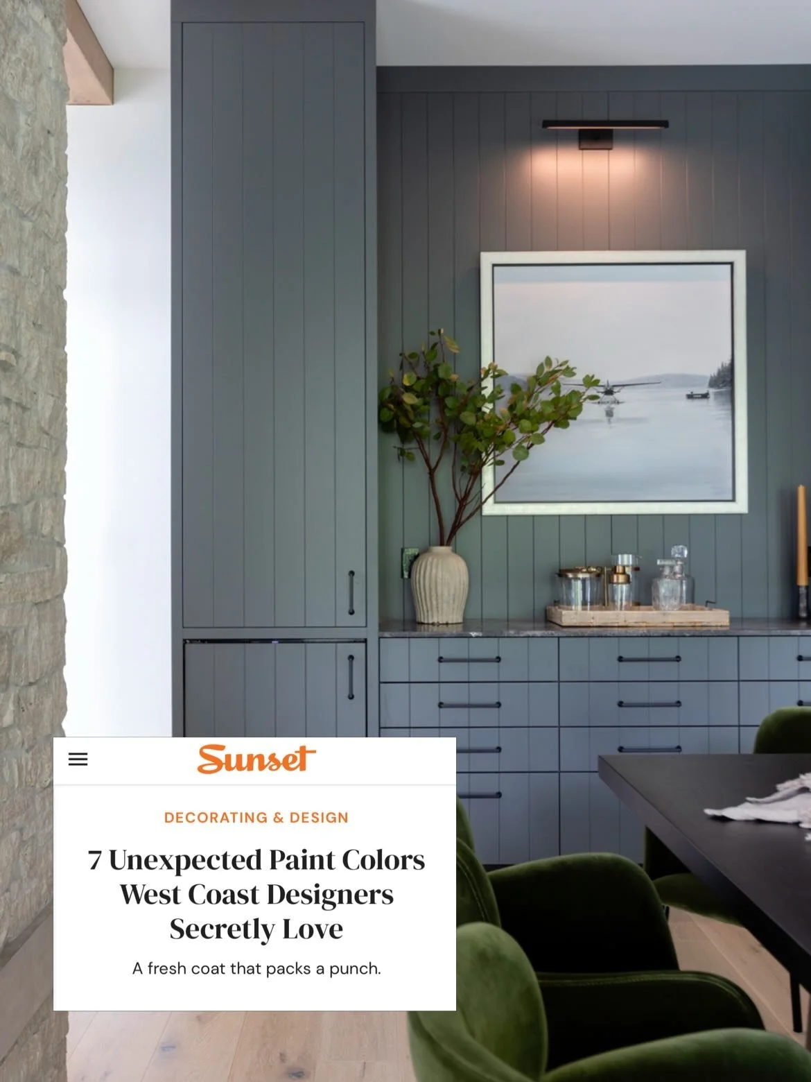
Down Pipe No. 26 by Farrow & Ball
“We love incorporating dark, moody colors that reflect the natural surroundings of the West Coast into our projects,” says Trish Knight, a designer based in Vancouver. Lately, she’s been digging Farrow & Ball’s Down Pipe, a lead gray with blue undertones. Knight recently used this shade in a coastal dining room to create a rich, luxurious effect.