
Homes & Gardens: How to Decorate with Sherwin Williams Crisp Linen
Featured by Homes & Gardens | Article by Amelia Smith
Designers love this peachy hue for its subtle glow and inviting feel. Here’s how they use the shade.
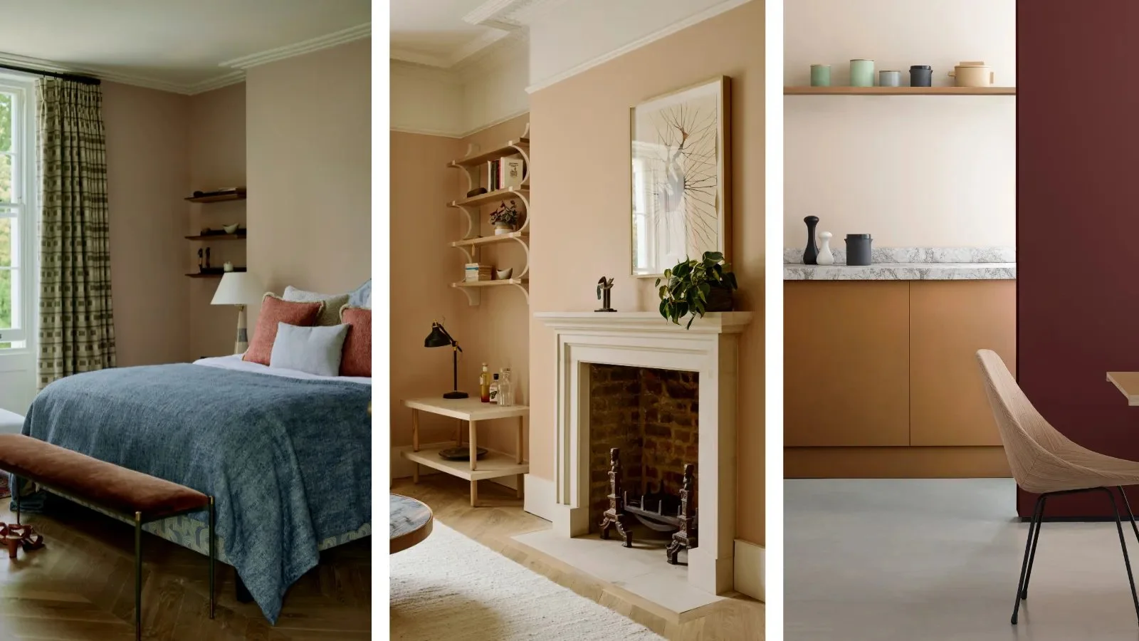
Image credit: Lauren Gilberthorpe Interiors/ Earthborn
While a quick glance at a room painted in Sherwin Williams' Crisp Linen might lead you to automatically think it's a white, spend a little longer looking and you'll soon see that there's a lot more to this shade that initially meets the eye.
If you've ever tested out white paint samples on your walls, you'll know that there is a plethora of whites, creams, beiges and ivories out there. And when they're placed side by side on your wall, the differences can feel huge.
How to Decorate with Crisp Linen
Trish Knight, interior designer and co-founder of Knight Varga Interiors, suggests that Crisp Linen works best alongside other warm colors. 'Crisp Linen really sings when paired with earthy tans, terracotta, and warm brass or gold accents,' she says.
From tan leather armchairs, to terracotta floor tiles and brass door handles, these warming hues compliment the warm peach undertones of Crisp Linen and help to pull out the heat in the shade.
The artificial lighting you choose can have an impact on the appearance of a paint color too, and Trish suggests choosing warm lighting to amplify Crisp Linen. 'I'd pair it with light fixtures featuring warm white or linen shades and bulbs with a warmer color temperature – around 2700K would be ideal.'