
Homes & Gardens: Interior Designers Say these 5 Colors Should Never be Paired with White
Think twice before pairing white with these five hues.
Featured in Homes & Gardens | Article by Emily Mooreman
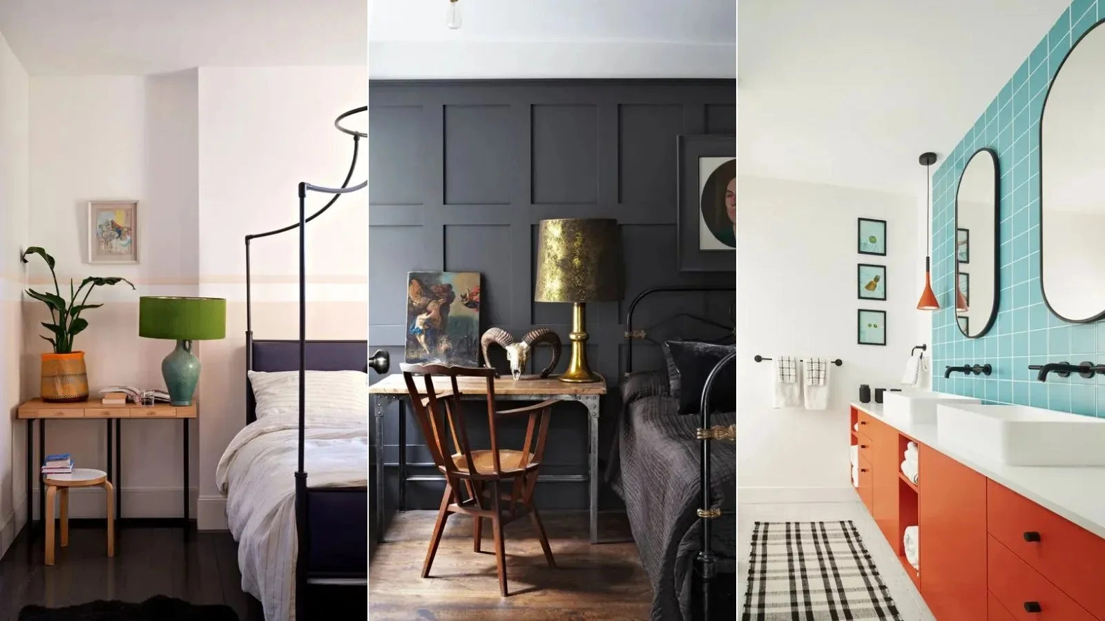
Image credit: Left and middle: Farrow & Ball, Right: Benjamin Moore
White is widely recognized as one of the most classic colors. Popular across many interior design styles and rooms, white is a timeless shade that provides a clean and neutral backdrop throughout the home.
Although white is achromatic meaning it, in theory, looks good next to all hues on the color wheel, decorating with white across color combinations for rooms should be done so carefully. Certain white color pairings can create an overly harsh look and distract from the calming quality of white.
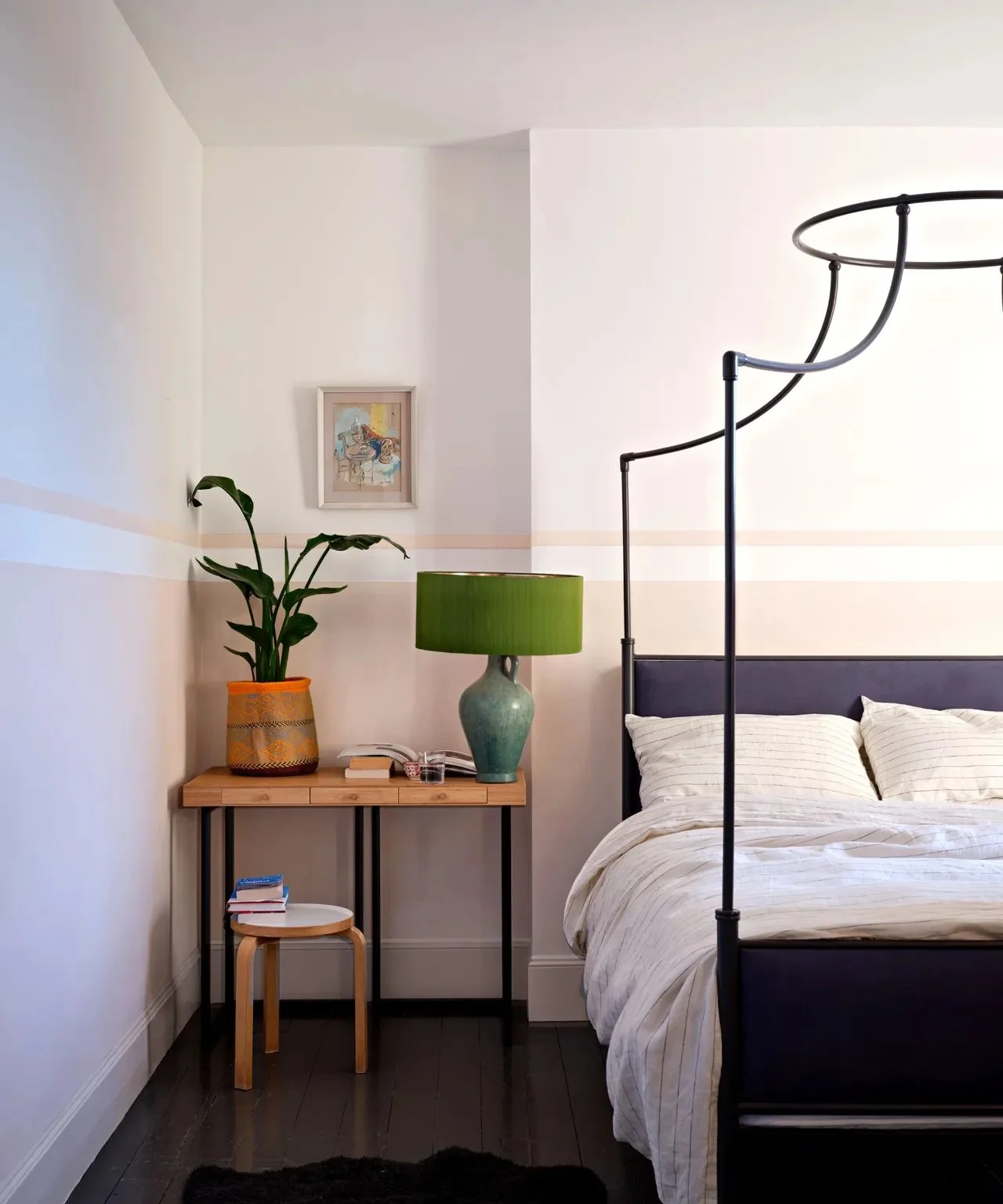
Pastels
'You need to be careful when pairing white with light pastel colors,' says designer Trish Knight of Knight Varga Interiors.
While pastel room ideas are generally seen as inoffensive thanks to their soft and delicate tones, it's important to ensure the undertones are cohesive if you incorporate white into the scheme. Trish continues to share that the degree of warm or cool tones should be reflected across the pastel tones and white for a harmonious look.
'If your walls are a warm white paint, the undertone of the pastel must also be warm, and vice versa with cool tones,' says Trish. 'For example, if you have warm peachy-terracotta tones you want to be sure to pair them with a warmer white.'
Image Credit: Farrow & Ball
Here, we've rounded up five colors that interior designers generally steer clear of in white room ideas. Read on to hear from the experts on what they do instead to make the most of this classic color choice.